
Do you know Badoit Rouge or Vittel water bottle with a red cap? What a color for just a mineral water! Isn’t it? Yet, these two products represent a real success of two brand strategies aimed at standing out from the crowd by choosing different visual codes commonly used in this category. It particularly aims at being more visible in the retail place, catching the consumer’s attention and arousing his curiosity, being more memorable, and finally communicating a different image from the competitors. However, how well do you remember Essensis from Danone and its pink packaging inspired from cosmetics? And how about, from the French wine market, the e-motif, Chamarré or even the Rock’n’Rhône? Probably nothing, but it is not a surprise. These products with a supposed innovative packaging have been quickly withdrawn from the market due to a strong rejection or ignorance from consumers.
How do we make consumers accept new visual codes for a well-known product category?
The research led by Cehlay and al., published in 2016 in Research and Applications in Marketing, brings to light new elements with the comparison of wine bottles tags from Bordeaux (France) and Barossa Valley (Autralia). While the French Bordeaux wine is known for its traditional tag design, the Australian Barossa Valley wine bottles are generally described as having a specific “style”, which has “revolutionized the packaging of wine bottles” (Ian Kidd, Australian designer).
Communicate on new themes
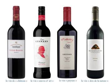
A content analysis among a sample of 117 wine bottle’ tags from Bordeaux and 161 from Barossa reveal that Australian wine bottles share, in majority, the same visual codes as the French bottles’ tag regarding the layout, the composition, the fonts, and colors. However, these bottle tags differ in terms of illustrations, which are more diversified. While the majority of Bordeaux bottles’ tags have a castle illustration or a blazon, only few of Barossa wine bottles use it. Unlike the Bordeaux, a large majority of Barossa wine bottles’ tags have an illustration related to the nature (vine stock, vine leaf, wine grape, tree, flowers, animals, etc.) or to the wine-grower (artisan or artist). The semiotic analysis shows that new themes and styles of illustrations introduced by Barossa are meaningful and relevant for the product category: the wine is indeed a natural product of which the quality is highly related to the natural environment, but the wine is also the result of the wine-grower work. The wine is often perceived as an artisanal product and sometimes as a work of art. Thus, the use of these new themes for wine bottles illustrations let’s develop brands’ storytelling more and more various which are structured around two main opposition: “nature/culture” and “place of production/winegrowers.”
Put into practice two key principles
Results suggest that Barossa wine brand respects two main conditions to innovate in terms of design:
- The well-known MAYA principle from Raymond Loewy (1951), according to which a design must be “Most Advanced Yet Acceptable.” By sticking to traditional visual codes from the wine category, Barossa wine bottles provide to the consumer an acceptable base on which the brand introduces new and innovative illustrations.
- A level of ideal incongruence by introducing unexpected illustrations themes (i.e. new or different) but relevant (i.e. enabling to develop a brand storytelling consistent with the wine universe).

Hey There. I found your blog using msn. This is a very well written article. I’ll make sure to bookmark it and return to read more of your useful info. Thanks for the post. I will definitely return.
LikeLike
Have you ever considered creating an ebook or guest authoring on other websites? I have a blog centered on the same ideas you discuss and would really like to have you share some stories/information. I know my viewers would appreciate your work. If you’re even remotely interested, feel free to send me an e mail.
LikeLike
I am in fact delighted to glance at this webpage posts which contains plenty of helpful data, thanks for providing these statistics.
LikeLike
Wow that was strange. I just wrote an really long comment but after I clicked submit my comment didn’t appear. Grrrr… well I’m not writing all that over again. Anyways, just wanted to say wonderful blog!
LikeLike
Thanks for your comments! and sorry for the delay ! just matter of timing ! Please continue following, more to come !
LikeLike